Choosing the perfect retirement party colors establishes the ideal tone for celebrating a remarkable career milestone. The right palette transforms a gathering from a standard office event into a deeply meaningful celebration of personal achievement. Selecting meaningful color schemes helps honor the retiree's legacy while welcoming an exciting new chapter of life with warmth, elegance, and stylistic flair.
Popular Palettes for Milestone Celebrations
Metallic Gold and Classic Navy
Combining deep navy blue with shimmering metallic gold creates an atmosphere of sophisticated accomplishment and timeless elegance. This palette honors a professional legacy by utilizing navy to ground the space with stability and traditional success. Meanwhile, rich gold accents infuse the venue with a sense of festive luxury and achievement. It works beautifully for evening banquets or country club gatherings, offering a stately backdrop that feels both grand and deeply respectful. The contrast allows decorations like table runners and banners to stand out crisply, ensuring the overall aesthetic remains polished and memorable for guests.
Soft Sage and Warm Cream
For a celebration focused on relaxation and new beginnings, soft sage green paired with warm cream offers a soothing environment. This combination evokes natural serenity, peace, and the quiet comfort of long-awaited leisure time. Sage represents growth and renewal, which beautifully symbolizes the transition into a slower, self-paced lifestyle away from demanding daily schedules. Cream provides a gentle, neutral baseline that softens the venue and enhances natural lighting. It is an exceptional choice for afternoon brunches, garden parties, or casual backyard luncheons where comfort and conversation are the primary goals.

Bright Citron and Crisp White
Incorporate energetic bright citron yellow alongside crisp white to emphasize a joyful, forward-looking celebration filled with optimism. This lively scheme focuses entirely on the excitement of future adventures, travel plans, and active hobbies that await the guest of honor. Yellow naturally boosts the energy of a room, keeping the atmosphere lighthearted, vibrant, and celebratory. White keeps the look clean and contemporary, preventing the bright citrus tones from overwhelming the visual space. It suits high-energy gatherings, daytime cocktail hours, or parties hosted in modern, open-concept venues designed for socializing.
Deep Burgundy and Muted Rose
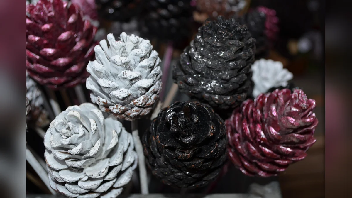
A palette of rich burgundy and muted rose creates a warm, reflective atmosphere perfect for an intimate and heartfelt gathering. This color choice emphasizes deep gratitude, emotional warmth, and the celebration of enduring professional relationships built over several decades. Burgundy adds depth and classic refinement to the decor, while muted rose introduces a soft, sentimental touch that feels welcoming. It is highly effective for cozy dinner parties or autumn celebrations where the focus rests on storytelling, shared memories, and genuine appreciation from close colleagues and family members.
Practical Styling and Decor Application
Implementing your chosen palette requires a balanced approach throughout the venue to ensure visual harmony without crowding the space. Focus primary colors on large surfaces like table linens and backdrops, while using accent shades for invitations, centerpieces, and cake decorations. This strategic placement creates a cohesive flow that guides guests naturally through the environment.
| Color Scheme | Primary Surface Color | Accent Detail Color |
|---|---|---|
| Classic Executive | Deep Navy Linens | Polished Gold Trim |
| Botanical Serenity | Sage Green Backdrops | Warm Cream Candles |
| Vibrant Adventure | Crisp White Base | Bright Citron Ribbons |
| Heartfelt Heritage | Rich Burgundy Napkins | Muted Rose Floral |
Essential Decor Coordination Checks
- Verify that the venue lighting complements your chosen tones without distorting the intended warmth or brightness.
- Ensure printed invitations accurately match the physical decorations used on the tables and entrance displays.
- Confirm that table centerpieces do not block eye contact or overwhelm the selected linen colors.
- Check that signage text remains highly readable against the primary backdrop colors chosen for the event.
- Review how the cake design integrates into the broader color scheme for cohesive presentation photographs.
Frequently Asked Questions
How do we choose colors if the retiree has multiple diverse hobbies?
Select a neutral base tone and introduce small, colorful accents that represent each distinct interest. This approach keeps the venue looking organized while still honoring various post-career passions through subtle, creative details across the room.
Should the former company corporate colors be integrated into the decor?
Incorporate corporate colors only if the retiree expresses deep pride and fondness for the organization. If they prefer focusing strictly on the future, prioritize personal favorite colors or relaxing palettes that symbolize upcoming leisure time instead.

Can we use seasonal colors for a retirement celebration?
Seasonal colors provide an excellent framework that feels natural and timely for guests. Blend seasonal tones with the retiree's personal preferences to create a sophisticated palette that fits the specific time of year perfectly.
Conclusion
Selecting the right retirement party colors elevates the entire celebration, turning a simple gathering into a beautiful reflection of a dedicated career. Whether you choose stately metallics or calming earth tones, a cohesive palette creates lasting visual memories for everyone involved. Begin by discussing personal color preferences directly with the guest of honor to establish the perfect event theme.